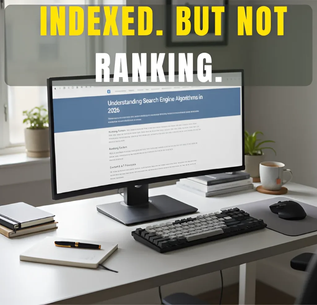
How Many Pages Does a Small Business Website Need to Rank?
Services Search Engine Optimization (SEO) Google Business Profile Optimization Graphics Design Social Media Marketing My Process FAQs Articles About Contact Services Search Engine Optimization (SEO) Google Business Profile Optimization Graphics Design Social Media Marketing My Process FAQs Articles About Contact Wanna Chat? Small Business SEO Basics How Many Pages Does a Small Business Website Need to Rank? Find out whether you need more pages or just better ones to rank on Google. The Short Answer (For Busy Business Owners) Most small business websites can rank on Google with about 5 to 10 pages. That may sound low, but it is true. Many small businesses rank with sites that size every day. You do not need a large website just to be taken seriously by Google. What matters more is what each page is about and whether it helps the person searching. A page should answer a clear question or explain a clear service. If it does not, it usually does not help your rankings. A smaller site with clear service pages often performs better than a bigger site filled with extra pages that overlap or never get traffic. If you are trying to decide whether to add more pages or fix the ones you already have, start with what you have. In most cases, strong pages come before more pages. What You’ll Learn in This Guide Why Page Count Alone Does Not Determine Rankings Why Page Count Alone Does Not Determine Rankings The Core Pages Every Small Business Website Needs The Core Pages Every Small Business Website Needs Pages You Probably Do Not Need at the Start Pages You Probably Do Not Need at the Start How Many Pages Is Ideal for Most Small Businesses? How Many Pages Is Ideal for Most Small Businesses? Quality Over Quantity (Why Fewer Strong Pages Win) Quality Over Quantity (Why Fewer Strong Pages Win) When Adding More Pages Actually Helps SEO When Adding More Pages Actually Helps SEO Common Mistakes That Prevent Websites from Ranking Common Mistakes That Prevent Websites from Ranking How I Can Help You Decide What Your Website Actually Needs How I Can Help You Decide What Your Website Actually Needs Where to Go From Here Where to Go From Here Frequently Asked Questions Frequently Asked Questions About the Author About the Author Why Page Count Alone Does Not Determine Rankings Google does not rank entire websites. It ranks pages. Each page stands on its own and is judged by how well it fits a search. That is why a small site with a few solid pages can outrank a much larger site that is spread thin. When Google looks at a page, it cares about a few basic things. ● Does the page line up with the search? If someone searches for a specific service, Google wants a page that clearly talks about that service. Not a general page. Not a mixed page. A clear one. Pages that try to cover too many topics usually do not rank well. ● Is it obvious what the page is about? A visitor should not have to scroll or guess. Within a few seconds, they should know what the page offers. If people land on a page and feel unsure, they leave. That tells Google the page is not a good match. ● Does the page actually explain things clearly? Strong pages answer common questions and explain the service in plain language. They do not try to sound impressive. They try to be useful. Pages that feel vague or incomplete rarely hold rankings for long. ● Is there a clear next step? Good pages guide people. Call. Book. Learn more. When visitors know what to do next, they stay longer and interact more. Google notices that behavior. Adding more pages does not automatically help. In many cases, it does the opposite. Pages that repeat the same topic or chase the same keywords can weaken the site. A few clear, focused pages usually do more work than a long list of half-finished ones. The Core Pages Every Small Business Website Needs Most small business websites do not fail because they are missing pages. They fail because the pages they do have are unclear or trying to do too much. You do not need many pages to start. You need a few pages that each do one job well. ● Homepage Your homepage sets the scene. It should quickly tell people what you do, who you help, and where you operate. Its job is not to rank for every service. Its job is to point visitors in the right direction. ● Service pages These matter more than anything else. Each main service should have its own page that clearly explains what you offer and how someone can get started. If a service makes you money, it deserves its own page. ● About page People check this page more than you might think. They want to know who they are dealing with. This does not need to be a long story. Clear, honest, and simple works best. ● Contact page This page should remove friction. Phone number. Form. Location if relevant. Nothing fancy. If it is hard to reach you, many visitors will not try twice. ● Optional blog or resource page A blog can help, but only if it has a purpose. Many small businesses rank just fine without one. If you do use a blog, it should support your services, not exist just to post content. When these pages are clear and focused, most small business websites already have what they need to rank and convert. Pages You Probably Do Not Need at the Start A lot of small business websites get heavy too early. Not because the business is big, but because pages were added before there was a real reason for them. This usually shows up in a few ways. ● Overbuilt service sub-pages It is common to see five or ten pages that all describe the same service,
How Many Pages Does a Small Business Website Need to Rank? Read More »