Why Do Some Logos Stick While Others Are Forgotten?

The art of logo design: 5 powerful factors that make logos memorable

Discover the simple design choices that make logos easier to recognize and remember.


Why a Memorable Logo is Essential for Your Brand

When people think of your business, what comes to mind first? For many, it’s your logo. A logo is the face of your brand, and it says a lot about who you are. A good logo doesn’t just look nice, it sticks in people’s minds and helps them trust your brand.

In today’s crowded market, standing out is key. A logo that’s easy to remember can help set you apart from the competition and make your brand more recognizable. It’s not just a picture; it’s a symbol that tells people what your business is all about.

What You’ll Learn in This Guide

Simplicity: How Keeping Your Logo Simple Enhances Recognition

Simple geometric logo displayed on a laptop for clarity and memorability

Simple logos are easier to remember. When a logo is clean and clear, people don’t have to think about it. They just recognize it.
That’s why some of the most well-known logos are also the simplest.

Think about Nike, Apple, or McDonald’s. There’s no extra detail, no confusion, just one clear idea. That makes these logos easy to spot and easy to recall.

Here’s why keeping a logo simple works so well:

● People recognize it faster

A simple logo is easy to see and easy to remember. Even at a quick glance, people know what brand it belongs to.

● It doesn’t go out of style

Simple designs don’t depend on trends. That means the logo still looks good years later, without needing constant changes.

● It works anywhere

Simple logos look good on websites, social media, business cards, signs, and ads. They stay clear whether they’re big or small.

● The message is clear

When there’s less going on, the meaning comes through better. People understand what the brand is about without overthinking it.

Distinctiveness: Standing Out in a Sea of Competitors

Distinct logo symbols shown on a laptop highlighting unique design choices

Your logo should make your business easy to tell apart from others. If it looks too similar to what competitors are using, people won’t remember it. When a logo feels different and original, it’s easier to notice, easier to recall, and less likely to be confused with another brand.

Here’s why being different matters:

● People notice what feels new

When a logo doesn’t look like everything else around it, it naturally grabs attention. That first moment of notice helps your brand stick.

● Similarity leads to confusion

Logos that look alike can cause people to mix brands up. If customers can’t clearly remember which logo belongs to which business, the logo isn’t doing its job.

● Unique colors help brands stand out

Color plays a big role in how people remember logos. Choosing colors that aren’t common in your industry can help your brand stand out at a glance.

● Original logos feel more confident

A logo that looks original feels intentional. It gives people the impression that the business knows who it is and isn’t trying to copy others.

Relevance: How Your Logo Should Reflect Your Brand’s Identity

Minimal logo displayed on a laptop in a calm, balanced workspace

A logo should match the kind of business you run. When people see it, it should feel right for your brand. If the logo doesn’t fit who you are or what you do, it can confuse people instead of helping them remember you. A logo works best when it reflects your values and the message you want to send.

Here’s why relevance matters:

● It sets the right first impression

Your logo gives people an idea of what your business is like. When it matches your brand, people know what to expect.

● It connects with the right audience

A logo that fits your brand speaks to people who are more likely to trust you and remember you.

● It keeps your brand consistent

When your logo matches your message, everything else feels more put together, from your website to your ads.

● It makes your brand feel real

A logo that reflects who you are feels honest, not random. That helps build trust over time.

Versatility: Ensuring Your Logo Works Across All Platforms

Brand identity elements applied consistently across digital and print mockups

Your logo will be used in many places, not just on your website. It will show up on social media, business cards, emails, signs, and more. Because of that, it needs to look good and stay clear wherever it appears. A logo that only works in one place can quickly become a problem for your brand.

Here’s why versatility matters for your logo:

● It stays clear at any size

Your logo should still look good when it’s small, like on a phone screen or social profile. It should also look just as clear when it’s large, like on a sign or banner. If details disappear when the logo is resized, it can be hard to recognize.

● It works both online and on paper

A versatile logo looks good on websites, social media, and emails, but also on printed items like flyers, cards, and packaging. You should not have to redesign your logo just to use it in a different format.

● It looks good on different backgrounds

Sometimes your logo will be placed on light backgrounds, other times on dark ones. A good logo stays easy to see and read in both cases. This makes it easier to use in different designs without issues.

● It saves time and keeps branding simple

When a logo works everywhere, you do not need multiple versions just to make it usable. This keeps your branding clean, consistent, and easier to manage.

Timelessness: Creating a Logo That Stays Relevant for Years

Logo concepts arranged on screen showing timeless and durable design styles

A logo should still feel right years after it’s made. When a logo is based too much on trends, it can start to look old fast. That often forces a business to keep changing its logo, which can confuse customers and make the brand harder to recognize over time.

Here’s why timeless logos matter:

● It doesn’t need frequent changes

Trendy logos often need updates every few years. A timeless logo stays usable longer, which helps keep your brand familiar and steady.

● People recognize it over time

The more often people see the same logo, the more they remember it. Keeping the same look helps your brand stay in people’s minds.

● It grows with the business

A timeless logo still works as a business grows or changes slightly. It doesn’t feel tied to one short phase or moment.

● It feels more trustworthy

Logos that last give the impression that a business is stable and reliable. Constant logo changes can make a brand feel unsure or inconsistent.

● It saves time and money

Redesigning a logo takes effort and cost. A logo that lasts longer reduces the need for repeated changes.

The Psychology Behind Logo Design: How Colors and Shapes Influence Perception

Computer screen displaying multiple logo shape variations in a design workspace

When people see a logo, they feel something right away. They don’t stop to analyze it. They just react. Colors, shapes, and fonts all play a part in that first reaction, whether people realize it or not.

Here’s how those design choices affect how a logo feels:

● Colors set the mood

Colors can change how a brand feels in an instant. Blue often feels calm and safe. Red feels strong and energetic. Green can feel fresh or natural. The color choice helps shape how people feel about a brand before they even think about it.

● Shapes change the tone

Rounded shapes usually feel softer and more friendly. Sharp shapes can feel bold or serious. Even small shape choices can change how a logo comes across.

● Fonts send a message

Simple fonts feel clean and easy to trust. More playful fonts feel casual or creative. The font helps show whether a brand is formal, relaxed, or fun.

● People make quick connections

Over time, people link certain colors and shapes with certain ideas. When a logo uses familiar visual cues, it becomes easier to understand and remember.

● First impressions happen fast

Most people form an opinion in just a few seconds. A logo that feels right from the start has a better chance of being remembered.

The Role of Typography: Why Choosing the Right Font Matters for Your Logo

Typography styles displayed on a laptop to compare logo font personality

The font in your logo matters a lot. It changes how people feel about your brand, even if they don’t notice it right away. Before someone reads your logo, the font already sends a message.

A good font makes your logo easy to read and easy to remember. A bad font can make it hard to read or feel wrong for the business.

Here’s why font choice is important:

● People need to read it fast

If your logo is hard to read, people will skip it. Simple, clear fonts help your name stick in their mind.

● Fonts show what kind of brand you are

Some fonts feel serious. Others feel friendly or fun. The font helps people understand your business without you having to explain it.

● First impressions happen quickly

People decide how they feel about a brand in seconds. The right font helps create a good first impression.

● The font helps people remember you

When the font fits your brand, the logo feels familiar. That makes it easier for people to recognize your business later.

The Influence of Colors in Logo Design: Understanding the Emotional Impact of Colors

Laptop showing logo designs in different colors to explore emotional impact

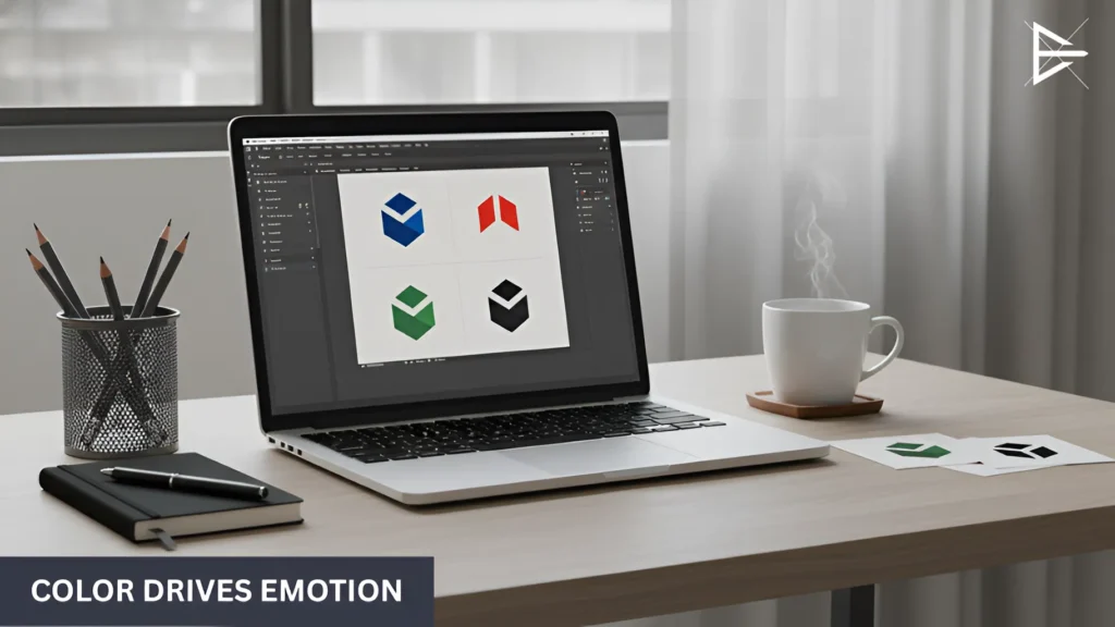
Color is usually the first thing people notice in a logo. Before they read the name, the color already gives them a feeling. That feeling matters because it shapes how they see the brand from the start.

Colors don’t tell the full story, but they help set the mood. If the color feels wrong, the logo feels off. If it feels right, the logo is easier to like and remember.

Here’s how people often feel about common logo colors:

● Blue feels calm and safe

Blue often makes people feel relaxed. It can make a business feel steady and easy to trust.

● Red feels strong and active

Red stands out fast. It feels bold and full of energy. That’s why brands like Coca-Cola use it to catch attention.

● Green feels fresh

Green is often linked to nature and growth. It can make a brand feel healthy or balanced.

● Black feels serious

Black can feel strong and clean. It is often used by brands that want to look simple and confident.

● Bright colors feel friendly

Colors like yellow or orange can feel warm and happy. They often make a brand feel open and welcoming.

How I Can Help You Create a Memorable Logo That Reflects Your Brand’s Essence

Designers reviewing a logo concept on a laptop during a branding discussion

If you already have a business but feel unsure about your logo, you’re not alone. A lot of business owners know what they want their brand to feel like, but they don’t know how to turn that into a logo.

That’s where I help. I work with you to turn your ideas into something clear and easy to recognize.

● Crafting a Logo That Represents Your Brand

Before I design anything, I take time to understand your business. I want to know what you do, who your customers are, and how you want people to see your brand. This helps make sure the logo actually fits your business and doesn’t feel random.

● Simplicity and Impact in Every Design

I keep logos simple on purpose. Simple logos are easier to remember and easier to use. They don’t need a lot of detail to work. When a logo is clear, people notice it faster and remember it longer.

● Logos That Look Great Everywhere

A logo should work in real life. It should look good on your website, social media, and printed materials. I make sure your logo stays clear and recognizable no matter where it’s used.

Crafting a Logo That Will Stand the Test of Time

A good logo doesn’t need to be fancy. It just needs to work. When a logo is simple, easy to recognize, fits the brand, works everywhere, and doesn’t rely on trends, it’s more likely to last.

Taking time to get your logo right helps your business in the long run. People remember it faster, trust it more, and recognize it wherever they see it. That makes your brand feel more stable and familiar over time.

Logo Design FAQs: What Makes a Logo Memorable?

What makes a logo easy to remember?

A logo is easy to remember when it is simple and clear. People should be able to recognize it quickly without needing to stop and think about what it means. When a logo feels obvious instead of complicated, it is more likely to stay in someone’s mind. Clear designs are easier for the brain to process.

Simple shapes, clean lines, and one clear idea all help make a logo memorable. When there are fewer details, people can focus on what matters most. If someone can recall your logo after seeing it only once or twice, that usually means the design is working. Memorability is a strong sign of an effective logo.

Why is a logo important for a business?

A logo is important because it helps people recognize your business wherever they see it. It acts as a visual symbol that connects customers to your brand. Even without words, a logo can remind people who you are. This makes it easier for customers to remember you later.

Over time, a logo becomes familiar to your audience. Familiar brands often feel more trustworthy and stable. When people see the same logo again and again, it builds confidence in the business. That trust can influence buying decisions.

How simple should a logo be?

A logo should be simple enough to understand at a glance. If people need extra time to figure it out, the design may be too complex. Simple logos work better in fast-moving spaces like social media and ads. They also reduce confusion.

Simplicity helps a logo stay clear at different sizes. A simple design is easier to remember and easier to reuse. It also works better across different platforms. Simple does not mean boring, it means focused.

Can a logo have too many details?

Yes, a logo can have too many details. Small details often disappear when the logo is used at smaller sizes. This can make the logo look messy or unclear. When details are lost, recognition suffers.

Reducing details helps improve clarity. A clearer logo is easier to read and easier to recognize. When only important elements remain, the logo becomes stronger. Strong logos communicate more with less.

How do I make my logo stand out from competitors?

A logo stands out when it looks different from others in the same industry. Many businesses use similar colors, shapes, and styles. This can cause brands to blend together. Standing out helps people tell brands apart.

To stand out, focus on what makes your business unique. Choose design elements that reflect your brand instead of copying trends. Original choices make a logo feel intentional. Intentional logos are easier to remember.

Should my logo follow design trends?

Design trends change quickly and often fade within a few years. A logo that follows trends too closely can feel outdated fast. This can lead to frequent redesigns. Frequent changes can weaken brand recognition.

Focusing on strong ideas instead of trends helps logos last longer. Timeless logos age better over time. They also feel more stable and trustworthy. Long-lasting logos support consistent branding.

How do I know if my logo fits my brand?

A logo fits your brand when it feels right for your business. It should match your values, tone, and audience. When people see it, it should make sense. A good fit feels natural, not forced.

If a logo feels confusing or off, it may not reflect your brand clearly. Misaligned logos can send mixed messages. Clear branding helps customers understand who you are. Understanding builds trust.

What colors work best in logos?

There is no single best color for all logos. Different colors create different feelings and reactions. The right color depends on your brand’s message. Color choice should support your goals.

Some colors feel calm, while others feel bold or friendly. Choosing colors that match your brand helps set the right mood. A good color choice makes the logo feel natural. Natural logos are easier to like.

Do colors really affect how people see a brand?

Yes, color affects how people feel almost instantly. Most people react to color before they read any text. This reaction happens without effort. It shapes first impressions quickly.

That first feeling can influence trust, comfort, and interest. A color that feels right can make a brand feel welcoming. A color that feels wrong can push people away. This makes color a key part of logo design.

How many colors should a logo use?

Most strong logos use one to three colors. Fewer colors make the logo easier to recognize. They also make the design easier to manage. Simpler color palettes reduce confusion.

Using too many colors can make a logo feel busy. Busy designs are harder to remember. Fewer colors help keep branding consistent. Consistency improves recognition over time.

Why does font choice matter in a logo?

Font choice affects how easy a logo is to read. If people struggle to read it, they may skip it. Poor readability hurts memorability. Readable logos perform better.

Fonts also communicate personality. Some fonts feel serious, others feel friendly or playful. The right font supports your brand’s tone. Tone helps people understand your business faster.

Should a logo use fancy fonts?

Fancy fonts can look creative, but they often reduce clarity. Hard-to-read fonts slow people down. Slower recognition leads to weaker recall. Weak recall hurts branding.

Simple fonts are usually easier to read. They work better at small sizes and on screens. Simple fonts are also more flexible. Flexibility helps long-term use.

What makes a logo versatile?

A versatile logo works well in many places. It should look good online and in print. It should also work on signs, cards, and ads. Versatility makes branding easier.

The logo should stay clear when resized. It should also work on different backgrounds. Logos that adapt well are easier to use. Easy use keeps branding consistent.

How do I test if my logo works everywhere?

View the logo at very small sizes. Then look at it at large sizes. Make sure it stays clear in both cases. Clarity should not be lost.

Test the logo on light and dark backgrounds. Try it on screens and on paper. This shows how it performs in real use. Testing prevents future problems.

Why is it bad to change logos often?

Changing logos often can confuse customers. When people see different logos, recognition drops. Recognition is key to branding. Losing it weakens trust.

Keeping the same logo builds familiarity. Familiar brands feel more reliable. Reliability increases confidence. Confidence supports long-term growth.

How long should a logo last?

A good logo should last many years. It should still feel right as the business grows. Growth should not break the design. Strong logos adapt well.

Logos built on clear ideas usually last longer. Trend-based logos fade faster. Long-lasting logos support consistency. Consistency builds recognition.

Can a small business benefit from good logo design?

Yes, a strong logo helps small businesses look professional. Professional appearance builds credibility. Credibility matters for first impressions. First impressions influence trust.

A clear logo also helps small businesses stand out. Standing out helps people remember you. Memorability helps growth. Growth supports long-term success.

Is it okay to redesign an old logo?

Yes, redesigning is fine when a logo no longer fits. Businesses change over time. Logos should reflect those changes. Updates can improve clarity.

Small updates are often better than full changes. Careful redesign keeps recognition. Recognition should not be lost. Balanced updates work best.

Should I design my logo myself or get help?

Some business owners design their own logos. This can work for simple needs. However, it often takes more time than expected. Mistakes are common.

Getting help can save time and stress. Professionals understand design basics. This leads to stronger results. Strong results last longer.

What is the biggest mistake people make with logos?

The biggest mistake is trying to include too many ideas. Too many elements cause confusion. Confusion weakens recognition. Weak recognition hurts branding.

Strong logos focus on one clear message. Clarity makes logos easier to remember. Simple messages stick better. Better recall leads to stronger brands.

About the Author

Harvie Ken Colonia

Hi, I’m Harvie!

I started working with SEO and websites in 2019, and over time I learned how much design affects how people see a business. Logos, layout, and small design choices often decide whether a brand feels clear or forgettable.

I now help businesses improve how they show up online by keeping things simple and easy to recognize. That includes logos, website design, and overall branding. The goal is always the same: make sure people understand your brand quickly and remember it later.

If your logo or branding doesn’t feel quite right, you’re not alone. If you want a second opinion or help figuring out what could be better, feel free to reach out and let’s talk it through.